Even the hottest trends of last season may get faded at this time of the year. The designs which were in-style some time back, now may become out-of-style. Like fashion industry even in the web world, trends come and go and to stay ahead in the race, it is essential to catch up with the current style. Usually web designers pay much heed to designs that are in fashion but ignore being acquainted with what is outdated. If you wish to follow the latest trends then you should also know which design styles to ditch. It is very important for the web- designers as well as business owners to avoid having an outmoded website, in order to entice the visitors. Even the minor trends which pop up each year is of the essence and certainly cannot be ignored. Web designing is a reviving art which needs to shed off few passé styles to stay fresh and lively. Following the latest trend will not only make your website dazzling but will also enhance the user experience.
Let’s bid farewell to some obsolete web design trends:
Websites crammed with text:
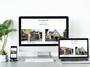
Responsive web designs have become need of the hour. Since more and more visitors have switched to mobile web, overcrowded web designs has gradually become outdated. People find it mind-numbing to read long chunks of text. It is not only boring but it increases the load time too. Until and unless it is a blog or news based website, avoid writing too much content. Keep the paragraphs short and to the point. Images play a major role to create visual impact on the visitors. So concentrate more on larger images and restrict the text element.
Assortment of fonts:
Since there is an wide assortment of fancy fonts available on web, it may seem to be totally irresistible but you have to control your tempt. Stick to those fonts that suit your website and ignore the rest. It is difficult to overlook the baroque fonts but what is its use if it cannot be read properly. Incorporate fonts that look stylish as well as are readable. In fact the ordinary Helvetica font can also be transformed into visually-appealing one with the help of typography and great layout.
Extravagant graphics:
Yes it’s crucial to design websites that are eye-catching and engaging but for that you cannot compromise on the functionality. 3D graphics and animated transitions are certainly up-to-the-minute but they may increase your page load time. Users want websites to respond fast. Hence, only make use of it if you really need it and keep it minimal or else it will hamper user experience.
Undervalue stock images:
Stock images have become a biggest nuisance for the web visitors. Either the images are reused or of bad quality which is actually a turn off. Completely avoid blurred, over glossy or out-of-focus images. Don’t feel reluctant to spend additional amount on these visual elements, if you really want to increase your visitors count. Do not use animated images for corporate websites or else it will look unprofessional. Good quality images are fundamental for portfolio, e-commerce and photography websites.
Lifeless User Interface:
Your visitors will surely get pissed off and take an exit from your site if they are not able to navigate or search for what they want. Now- a- days, web visitors have become more impatient and want everything instantly. Navigation should be simple and content should be clearly arranged in the layout. All web information should be self-explanatory. Search should be prompt and effortless. UI should be compatible with mobile web too.
Remember there may be some design styles which may not be in vogue but are timeless. It may be admired by the users and prime factor for good traffic, so do not eliminate such features. You cannot revamp your site with every new trend, just focus on which factors to incorporate, what to modify, which to ignore and give a complete facelift to your website.


